¿Cómo ajustar un gráfico de barras en Excel para hacer que las barras sean más anchas?
Este artículo explica cómo ajustar un gráfico de barras en Excel para que todas las barras aparezcan más anchas, tal como se muestra en la siguiente captura de pantalla.
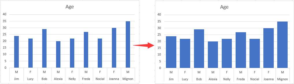
Ajuste el Gráfico de barras para hacer la barra más ancha en Excel
Ajuste el Gráfico de barras para hacer la barra más ancha en Excel
Para hacer que las barras sean más anchas en un gráfico de barras, siga estos pasos.
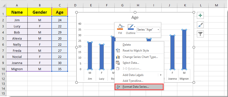
1. Haga clic en cualquier barra del gráfico de barras, pulse con el botón derecho del ratón y seleccione Formato de serie de datos en el menú contextual. Vea la captura de pantalla:
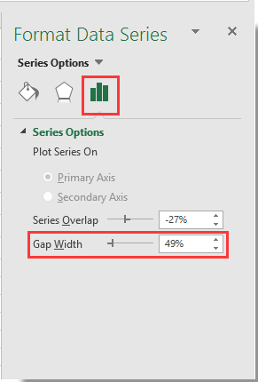
2. En el panel emergente Formato de serie de datos, desplace la barra deslizante del Zoom del Ancho del intervalo hacia la izquierda hasta que el ancho de la barra se ajuste a sus necesidades, en la sección Opciones de serie. Vea la captura de pantalla.
3. Cierre el panel Formato de serie de datos.
A continuación, podrá observar cómo las barras del gráfico de barras especificado se vuelven más anchas, tal como se muestra en la siguiente captura de pantalla.

Descubra la magia de Excel con KUTOOLS AI
- Ejecución inteligente: Realice operaciones en celdas, analice datos y cree gráficos con comandos sencillos.
- fórmulas personalizadas: Cree fórmulas a medida para optimizar sus flujos de trabajo.
- Programación en VBA: Escriba e implemente código VBA con facilidad.
- Interpretación de fórmulas: Entienda las fórmulas complejas con facilidad.
- Traducción de texto: Rompa las barreras del idioma directamente en sus hojas de cálculo.
Las mejores herramientas de productividad para Office
Potencie sus habilidades en Excel con Kutools para Excel y experimente una eficiencia como nunca antes.Kutools para Excel ofrece más de 300 funciones avanzadas para aumentar su productividad y Ahorrar tiempo.Haga clic aquí para obtener la función que más necesita...
Office Tab aporta una interfaz con pestañas a Office y hace que su trabajo sea mucho más fácil
- Active la edición y lectura con pestañas en Word, Excel, PowerPoint, Publisher, Access, Visio y Project.
- Abra y cree varios documentos en nuevas pestañas dentro de la misma ventana, en lugar de hacerlo en ventanas separadas.
- ¡Aumente su productividad en un 50 % y elimine cientos de clics del ratón cada día!
Todos los complementos de Kutools en un solo instalador.
Kutools for Office es la suite que incluye complementos para Excel, Word, Outlook y PowerPoint, además de Office Tab Pro, ideal para equipos que trabajan en distintas aplicaciones de Office.
- Suite integral— complementos para Excel, Word, Outlook y PowerPoint + Office Tab Pro
- Un instalador, una licencia— configuración en minutos (compatible con MSI)
- Rendimiento mejorado en conjunto— productividad optimizada en todas las aplicaciones de Office
- Prueba gratuita de 30 días con todas las funciones— sin registro ni tarjeta de crédito
- La mejor relación calidad-precio— ahorre frente a la compra individual de complementos